Cait started her creative career in high school as editor in chief of her school’s literary magazine. There was no staff to teach the subject, so she figured it out as she went. In college, she served an apprenticeship as a student designer, and after graduation from Mills College with a degree in literature and creative writing, she became a junior art director. She continued her education in design, receiving a Master of Fine Arts in Industrial Design.

Those creative experiences make her an interesting fit at the Lab, even after 19 years, where most of the focus is on science. Recently Cait and her team in Creative Services re-worked the Lab’s logo and added more colors to the palette.
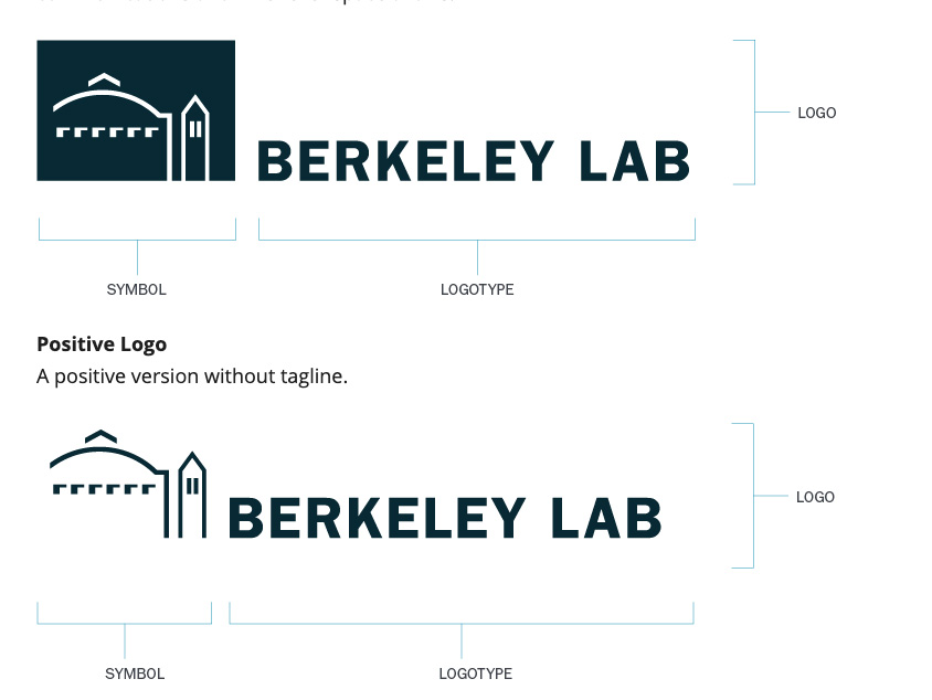
The Lab’s logo consists of two parts; the graphic element and the typography. This is known as a lock-up. They cannot be separated or altered and must always be shown as a whole.
Recently, the team created an identity for each division within Operations. The use of these are optional. The Operations lock-up, the combination of the graphic  elements and the typography, provides prominence for the division without losing connection to the Lab. These new lock-ups remind everyone that Operations is here to support science, and as one shuttle driver likes to say each morning, “Today is a great day to support science.”
Creative Services is ready to assist with any project, including banners, brochures, and photography. The team also produces business cards, headshots, and flyers for brown bags and lectures.
Cait will answer your branding, logo, and creativity questions in a Zoom session on Thursday, April 16 at 1 p.m. Add the session to your calendar.
Q: What does the Lab’s logo represent, and how does it make the Lab stand out in the community and with our stakeholders?
A: The logo includes two iconic images, the ALS and the campus campanile, to show the long-standing connection between the Lab and campus. We tweaked the lines of the image to streamline it, making the lines equal, and providing more visual weight. This version provides better reproduction for digital use. We also offer more lock-ups, the combination of the graphic element and the typography, so that designers can have horizontal, vertical, positive, and negative options.
Q: Why did you add more colors to the Lab’s branding? What is the meaning of the colors?
A: Brand isn’t the logo or typeface; it is how people relate to the organization. Color elicits an emotional response. Dark blue, our foundational color is history and consistency and is associated with science and technology. It supports the other colors in the palette. Brighter colors add excitement that calls out key information and communicates the Lab is a modern, exciting place. Color draws the eye into the design and provides an emotional response.
Q: For many of us, being creative seems like a daunting challenge. What is creativity, and are there tricks to make it flow in each of us?
A: Creativity is problem-solving. It is critical thinking that looks at all sides of an issue. Creativity is not making things pretty. You don’t have to be a fine artist to be creative. Design is a problem-solving discipline where the goal is to communicate and get people’s attention. You can’t be a scientist without being creative. You need to think through the problem, design a solution, and measure its effectiveness at the end.